Perfect for a little girls bedroom, if I say so myself!
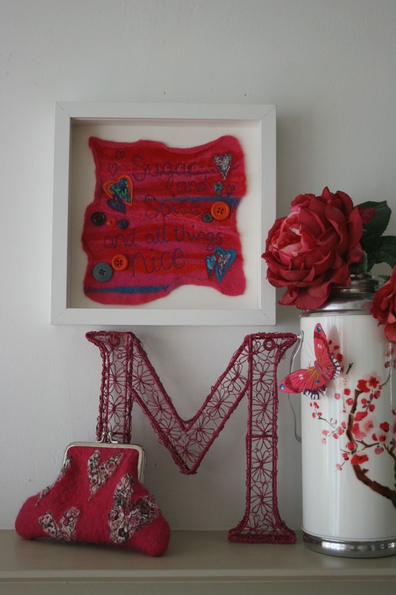
After many (MANY) hours of trying to photograph my pictures, I have discovered the trick... (suggested by my huband) "have you tried taking the glass out of the frame?"
Erm, no, hadn't thought of it! It works, it really works!
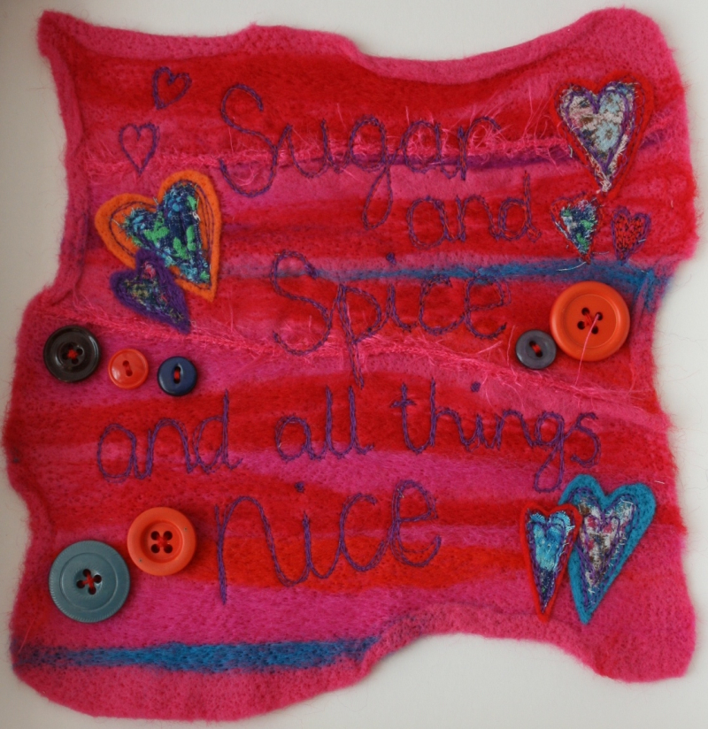
So, you can see far more detail can't you? and without the glare!
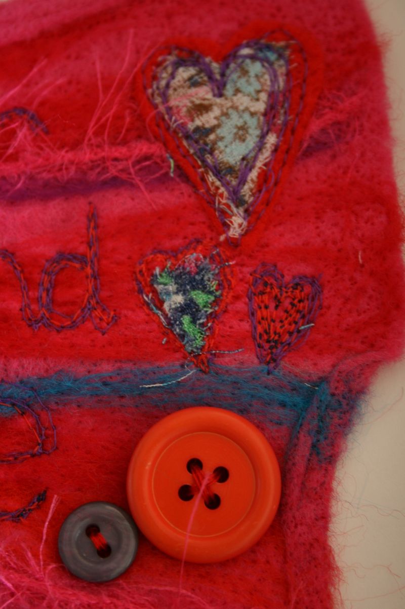
When I take close up photographs like this one, I know that everyone will be able to see the imperfections. Hopefully, you'll also see the little elements that I add to each one, like the heart on the right (above). It looked too plain, so I used two different coloured threads, a lighter one on top and a dark one on the bottom, and stitched into the heart, to give it depth.
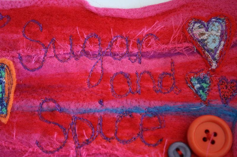
I spend a long time planning the balance of colours, making the felt in the background and picking the colours to go on top. One of the things I really like to do is use at least two colours to stitch the writing, thus creating more harmony. I don't want these pieces to look too rigid, they are made by hand and therefore I want them to look like that. They are crafted with care, and although I might use the same colours as another, or the same theme, no two will look the same.
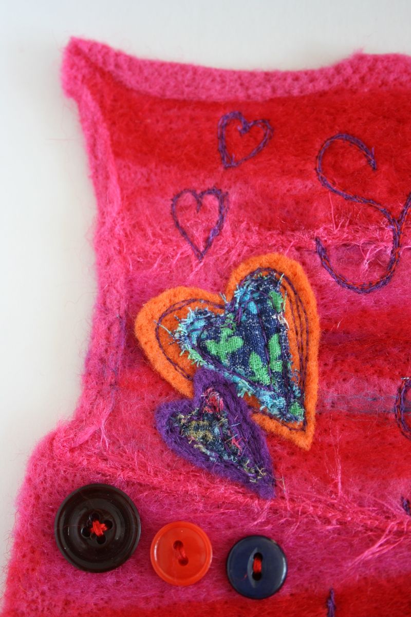
When I choose the buttons, I choose them for their size, colour and how well they balance the whole piece. I always try to make the button holes go in different directions, why? I'm not sure, but it is something that I can be quite pedantic about (I have been known to take a button back off and re-sew it if it doesn't look right).
Obsessed... moi???
Recent Comments